Tuesday, May 10, 2011

Typography in Scott Pilgrim!


Scott Pilgrim vs. the World! There are SO many movies out there that attempt to take a classic comic book and translate it into a theatrical work of art. Many of them succeed! For instance, pretty much any superhero movie has its roots in the vintage comic book scene. And there is such a successful market in that genre of film. However, I think rarely do we come across a film that truly embodies the classic aesthetic of comic books. This film is one of those. It's a comic book come to life. 

The use of typography in Scott Pilgrim is what really impressed me. Before seeing this film (which, by the way, I had never read the comics before seeing it) I had never heard of the term "Kinetic Typography." When I decided to do some research on the use of type, I kept coming across this term! It's the technical name for the use of "moving text," the animation technique that was so wildly embraced in Scott Pilgrim. Every action or sound was coupled with a comic book-style exclamation. This is what made the movie work for me!


The Female Image in Advertising

1. Examine Bayer's "Great Ideas" advertisement (page 347, Meggs). Compare Bayer's association of the female image with excess and corruption with contemporary treatments of women in ads. Do we still see this same association? If so, how has it changed? Is it now seen as a good thing or a bad thing? Use at least two contemporary ads.

In this advertisement, called "Great Ideas," the campaign designer is trying to communicate a message of warning, heeding the public to take care against falling into the trap of unwise lifestyle choices. The collage of objects used to represent this dangerous lifestyle portrays symbols of gambling, alcohol, excessiveness, indulgence, and greed. The figure of the woman is used to embody this wild lifestyle, as she herself becomes an object, just like the dice or fruits or alcohol.

The use of female figures as an object has been a long-standing tradition in advertisement design. In today's society, women are often portrayed in a negative light, used simply for sex appeal in order to sell objects to men. The most obvious culprits are the products that have an high percentage male target audience, specifically cars, food, and alcoholic beverages that are geared toward men. Scantily-clad women are often portrayed as little but another object of desire, subliminally promising men that the purchase of whatever product is being advertised will heighten their potential for achieving the coveted lifestyle that is depicted. The examples are endless, so much so that we have grown accustomed to seeing many of the images of women in advertisements as highly perfected symbols of sexuality and excessive living. Here are some contemporary examples:


Skyy Vodka Ads

Budweiser

Dolce & Gabbana Campaign

Ludacris Album Cover

Car Advertisement

Mens Accessory Line Ad

 Esquire's iconic Muhammad Ali cover (page 398, Meggs) makes a visual comparison between a contemporary controversial figure and a famous image from the history of art. Describe how this approach affects the viewer by conveying a powerful philosophical statement without the use of words. Offer one contemporary example of a similar image and do a quick compare/contrast between it and the Esquire cover. (Campaign 2008 is a good stop).


The use of recognizable art imagery is a powerful tool in any form of propaganda. Images such as paintings by the masters of the renaissance have become so widely recognizable that their emotional content can be applied to many various forms of expression and still read with the same message. The philosophical content is carried through. In the example provided, an image of Muhammad Ali is intended to mimic the classical painting of St. Augustine being martyred. The Esquire cover borrows the emotion and connection of the painting, displaying Ali as a martyr, one to be sympathized with. Even taken out of context, despite not knowing much about the controversy that surrounded Muhammad Ali's  career, I instantly understood the message that was intended in this cover.

In the same way, any highly famous and recognizable painting can be recycled to communicate a message. In researching, I found a plethora of satires of paintings by the Renaissance masters, specifically da Vinci. I found it interesting that so many satires had been made of works such as Mona Lisa and the Last Supper. For example, I found a trend that many television shows have followed: creating their own version of the Last Supper using characters from each show. By depicting the various characters in the positions of Christ and the twelve apostles, these images, without any verbal explanation, give a lot of depth to the cast. Without having seen a single episode of many of these shows, I feel that I know a lot about each character's specific role and how they are meant to be perceived by the viewer. Here are just a few of the examples I found:

Original, The Last Supper by da Vinci


House

Looney Tunes

Lost

The Sopranos

The Simpsons


Monday, May 9, 2011

Eggleston at the Frist!

I. Love. William. Eggleston.

When I first researched Eggleston before going to see an exhibit of his work at the Frist, I was confused to say the least. His pictures are just snapshots of junk! They are so boring. Not just boring, they are depressingly unspecial. But that's when it hit me. The normalcy of these images is what makes them. Eggleston truly is finding something worth looking at in that which is typically overlooked. His images are ironic. They seem completely unplanned and unposed, yet their subjects read as entirely intentional. Eggleston succeeded in capturing the normalcy of everyday life in Memphis. To say the least, he is the ultimate hipster.


Coming from the perspective of a hopeful photographer, I look at photography with an extremely critical eye. I have spent the past several years in a photography class, being asked to shoot my surroundings and create visual interest out of the things I pass by on a regular basis. After a couple rolls of shooting the same old cliché shots of the fountain and the statues and the belltower, I realized my dilemma; the dilemma every photographer faces: how do I take a picture of something ordinary and make it interesting? How do I capture the essence of the overlooked? How do I give life to things and make people pay attention to something they might not have noticed on their own? This is my goal as a photographer. And I think very few accomplish this goal as thoroughly as Eggleston has.


Saturday, May 7, 2011

Rebuild Alabama! Lester Beall Style!


I created a poster that embodies the mission of 1940s designer Lester Beall: I used minimalism and the emotional connection of solid blocks of national colors to stir in the viewer a sense of connectedness, encouraging one to take part in helping the relief efforts following the tragic tornado disasters that occurred in Tuscaloosa recently. 

Something that I particularly love about Lester Beall's images are the lighthearted emotional quality he incorporates into his work. Despite his very serious subject matter,  Lester uses images that invoke an optimistic sense of volunteerism. While many designers tend to approach grave subjects in the opposite manner, taking care to communicate a tone of seriousness in their work, Lester Beall seems to take the opposite approach. Rather than warning or subduing his audience, he aims to inspire and provoke good. In a sense, I feel like his work is a visual pep talk. I tried to emulate this by incorporating images that would draw the viewer in, sparking interest and creating an optimistic approach to the problem.

Like Lester, I used the national colors, red, white, and blue, to invoke a sense of national pride and responsibility. Lester's work feels very authentic and classically "American." He uses bold blocks of color to communicate a very bold message. Essentially I feel that the contemporary American public would respond to posters in Lester Beall's style in the same way that his work was received in its day. I feel that a promotion of national pride and a sense of community and volunteerism are held high today just as they have been in our nation's history. I hope to achieve the same reaction as Lester Beall's poster's achieved.

I posted my work on several sites to elicit a reaction. Here are some of the links!

Sunday, April 17, 2011

Poster Project


I chose to create a poster illustrating one of my favorite albums: For Emma, Forever Ago by Bon Iver. This is what the album looks like:


More importantly, this is what the album sounds like:
Bon Iver - For Emma, For Ever Ago - A Take Away Show from La Blogotheque on Vimeo.

Here's some explanation of how my work characterizes many of the important components of the Arts and Crafts Movement as well as the Art Nouveau style.

1. The Arts and Crafts Movement was characterized in part by a desire to elevate the fields of print and design to "their rightful place beside painting and sculpture," essentially applying the importance of the "fine arts" to all forms of visual and creative expression. Therefore, this poster, which symbolizes many of the themes of Bon Iver's album For Emma, Forever Ago, embodies the idea that visual work created for the purpose of communication is just as valuable as work created for expression's sake.

2. The Arts and Crafts Movement sparked a growing interest in the areas of typography, graphic design, and printmaking. The growth in book design led to a renaissance in typography and revival of the printed arts. The typeface that I used for the album title is called De Roos. This font is a mimicry of the work of Dutch type designer Sjoerd H. De Roos, who is known for his careful attention to detail in symmetrical layout, margin proportion, leading and kerning (space between lines and letters in a document). His dedication to pristine typography led to a new standard for typefaces that were practical, aesthetically pleasing, and easily legible.

3. One of the most recognizable names of the Arts and Crafts Movement is William Morris, a craftsman and type designer known for his philosophy that design was the vehicle that could unite art and industry, bringing art to the working class. His accomplishments in the design of beautiful typefaces, as well as ornate, lavish book decorations, set his books apart and blurred the line between printing and artmaking. The floral border is taken from Morris' trademark design for the Kelmscott Press, and the background design is another example of Morris' exquisite attention to detail. 

4. The rise of the Art Nouveau style is led by a drastic shift away from the busy, detailed ornamentation of the Victorian era toward the simplicity of modernism. This is seen especially in graphic works that used bold shapes and blocks of color to communicate various forms. I incorporated an illustration of a flower in a vase by American designer Will Bradley because it is a good example of the rising minimalist illustration methods that became recognizable characteristics of the Art Nouveau movement.

5. After looking through quite a few examples of work that represents the Art Nouveau style, I noticed a specific recurring color palette and tried to incorporate these colors into my design to accomplish a successful mimicry of the emotional quality of Art Nouveau work. Many of the posters mentioned in our readings and in class use very bold, brightly contrasting colors, usually reds and yellows outlined by stark black shapes and linear designs. 

6. A popular artist from the Art Nouveau period was Alphonse Mucha, who became famous for his elegant illustrations, characterized by their organic, plantlike linear forms and exploration of the stylized, romanticized feminine form as a subject matter. I used one of Mucha's famous illustrations as the main subject of my collage because I think the style and tone of this piece truly captures many of the most important aesthetic qualities of the Art Nouveau movement. 

7. Some of the recognizable characteristics of Mucha's work, along with similar artists of the time, are the busy aesthetic and the seeming desire to cover every available space with intricate, interactive designs. This is represented in my use of overlapping pattern and intricate design. I tried to create a style that reflected this aesthetic, hence the asymmetricality and heavily ornamented style.

8. Another wildly popular Art Nouveau artist was Henri de Toulouse-Lautrec, a French artist and designer known for ushering in the style of modernism. By combining drawings with typography, his posters unified art and functionality, which is one of the identifiable characteristics of art nouveau design, from graphic design to architecture to object design, etc. In a sense, the collage I created does just that, because it is a visually expressive piece that aims to communicate the themes of a body of musical work to the viewer. I chose to incorporate Toulouse-Lautrec's iconic image of the creepy man in the bright red scarf, because I think it represents Justin Vernon's self portrayal in his album For Emma, Forever Ago. (I'll explain this later).

9. Toulouse-Lautrec's style, as well as that of fellow artists Aubrey Beardsley and Theophile Alexandre Steinlen, has been defined as a major influence in the shift from Victorian to Art Nouveau. These artists emphasized stylized, flat forms of color, along with "simplified symbolic shapes" and "dynamic spatial relationships." These bold forms drew interest toward the trend of invented lines and designs that seem like glorified doodles, which became the precursors to abstract art. The flat shapes that create the man in the red scarf and the funky red flower, as well as the abstract design behind the woman in the Mucha piece, all illustrate these aspects of the Art Nouveau movement.

10. Many of the philosophical ideas of the time came through in the art of the Art Nouveau period. Artists used their work to express their philosophies, and many of the famous pieces from the time carried a heavier symbolic meaning than had been associated with visual art in the past. The Art Nouveau movement is characterized by rapid growth in the close collaborations between visual artists and writers, and so the art that comes from this time is seen as a more personal expression of cultural ideals than ever before. The reason I chose to illustrate For Emma, Forever Ago was because I think this album incorporates many themes that relate not only to my personal life this year, but also to the way I have come to view my society and the process of living life as an American college student. The album itself is the frontman Justin Vernon's account of a time he spent isolated in a cabin in the woods of Wisconsin, escaping from the world to spend time dealing with and growing from a few harsh blows that life had dealt him. Some of the themes that I personally appreciate and identify with are broken relationships, dealing with change and uncertainty, realization of one's weakness, and the process of growing and changing. The basic idea of my poster is that the two individuals represent people that have experienced life together and are learning to grow apart and learn from their mistakes. I think the concept of incorporating these personal and even spiritual themes is an important component of the Art Nouveau movement.


Here's a closer look at the individual works I drew from, as well as some information about each piece:

Ambassadeurs
Henri de Toulouse-Lautrec
1892

Victor Bicycles
Will Bradley
1899

Kelmscott Press Logo
William Morris
1890

Zodiac
Alphonse Mucha
1896

Clover detail
William Morris
1890's


De Roos-inspired typography

William Morris-inspired letter form

Friday, April 1, 2011

Lessons from the Week!


This week I really enjoyed getting into the advent of photography. Obviously I'm interested in photography and I thought the specifics that we learned were really interesting! I loved the examples shown in class that featured human subjects. There was such an obvious difference in how portraiture was perceived then in contrast to how it is now. The heavy influence of the painted portrait made for a much more intentional style of portraiture. I love it. The images didn't look stiff, but rather elegant and filled with character. I'd like to use these images to inspire a project of my own!

Tuesday, March 22, 2011

The Advent of the Printing Press!


 The advent of the printing press sparked a revolution in the distribution of informative material in the 15th century in Europe. Not only did the invention of the press provide unforeseen advancement in the production of books, but in doing so it served as a catalyst for social change. By analyzing five examples of books produced during the time surrounding the advent of the printing press, I hope to achieve a better understanding of not only the difference that the printing press made in the physical production of material books and development in bookmaking as a physical process, but also how the process of printing books changed the way that society perceived the distribution of information and how changes in bookmaking directly relate to societal reform in the fifteenth century in Europe.

1. The Book of Kells

The first book I chose to analyze is The Book of Kells, which is undoubtedly the most famous example of the insular manuscripts and Celtic hand-illumination, the method of bookmaking that was prominent before the invention of the press. Created by Celtic monks around the year 800 in Ireland, the Book of Kells is the physical representation of the process of bookmaking prior to rise of the press in the mid-1400s. 
The book itself is comprised of the four Gospels of the Bible, each hand-scripted in the traditional Insular majuscule, the traditional medieval writing system which is recognizable through its use of diminuendo (oversized initials at the beginning of a block of text that, by the end of the text line, gradually shrink to the normal text size) as well as historiated initials (enlarged and heavily illustrated letters at the beginning of a paragraph). 
Because of the complicated hands-on process of creating the text itself, it is understandable that the actual letterforms in the insular manuscripts contributed heavily to the overall aesthetic of the work. In a sense, the text itself contributed just as much to the aesthetic value as the purely decorative elements, such as the carpet pages, This is one of the aspects that makes the Book of Kells as well as all the Insular manuscripts so different from works created after the printing press. The uniqueness and extreme attention to detail that comes from hand-illumination cannot be duplicated in the use of a press.  
The majuscule is recognizable as the work of at least three different scribes, which is understandable considering the length of the text. The process in which the monks worked together in a scriptorium, or writing room, was an elaborate team effort, requiring various scribes and artisans who were trained specifically to perform different tasks throughout the complex process of the creation of the book.
The illustration and decorative qualities of the book were of the utmost importance, not merely serving for aesthetic pleasure, but actually intended to be used for their educational value as visual imagery and, according to Meggs, used to "create mystical and spiritual overtones." For this reason, the Book of Kells contains more ornamental elements than most books in the history of bookmaking. Not only are there full pages of entirely illustrated elements, or carpet pages, but there are also zoomorphic images, intricate knot work, and complicated lacertines. 
The book was physically comprised of hundreds of sheets of expensive and high-quality calf vellum, and each set of pages, or folio, was hand-bound into four volumes. The final result was an incredibly costly piece of work. It is because of this unbelievably complicated process that very few books were created during this time, and the lack of reading material, which coincided with the extreme illiteracy that plagues Europe at the time, is understandable. Later advancements in bookmaking and printing techniques provided ways for books to be created without the backbreaking intensive labor of the Scriptorium. It is because of this new efficiency that the printing press and its surrounding advancements can be credited as one of the most valuable inventions in history.

2. The Commentary of Beatus on the Apocalypse of Saint John the Divine

The next work I chose to compare is the Commentary of Beatus on the Apocalypse of Saint John the Divine, which was an interpretation of the book of Revelation, written in 776 A.D. by the scribe Beatus, for the King and Queen of Spain. Created in multiple versions throughout Spain, this work is an example of the style and accomplishments of the various Spanish scriptoriums. 
The Spanish style was distinctive from that of the Book of Kells and other Insular manuscripts because of Spain's unique combination of Christian religious and Moorish design influences. In fact, several recognizable Islamic motifs are seen pervading throughout the various Commentaries of Beatus as well as several other works produced by the Spanish Scriptoriums. The Spanish designs reflected a desire for "intricate geometry and intense, pure color."
Similarly to the Book of Kells, the richly detailed illustrations in the Commentary of Beatus held high importance to the overall work. The stark, bold imagery provided strong visual interpretation for the jarring stories from the Book of Revelation. 
The attempt to visualize these horrifying apocalyptic scenes demonstrates a cultural obsession with the end times and preparation for the Apocalypse. The illustration and distribution of Beatus's Commentary helped to form a widespread cultural panic at the turn of the first century A. D., when the end was believed to be coming. The effect that the production of these books, even in their small number, had on the general population can be considered a precursor to the  effect that the development of printing technique and the distribution of printed good had on the society of Europe.

3. The Gutenberg Bible

The printing press was invented by Johannes Gutenberg in 1450 in Germany. The first book to be printed in the movable type printing method was Gutenberg's 42-Line Bible, often referred to as the Gutenberg Bible. The production of the Gutenberg Bible ushered in the age of the printed book. 
This first printed book didn't create much of an immediate stir, as the copies were sold as manuscripts like any other. However, as soon as news spread of Gutenberg's invention,  printing spread across Europe. By 1480, sixty-eight European towns had printing presses, and the numbers grew rapidly from then on. Printing became a cultural phenomenon as libraries began popping up in monasteries and personal collections across the continent. Books were less of a treasure and more of a commodity. Printed matter stood for change. 
The craze for these books eventually spilled into a demand for newspapers, flyers, tracts, posters, and more. The production method was unbelievably affordable and timely than the creation of traditional manuscripts, allowing books and other printed materials to be sold and distributed for a fraction of the earlier cost. The excess of printed material found its way into the hands of the common man, and illiteracy rates began to fall. 
Because Gutenberg's invention was the first machine to take place of human labor, it sparked a revolution. There was no longer a need for an entire scriptorium of trained craftsman slaving away over the production of one book. Rather, production became a relatively thoughtless process. The idea that man could create machines to do work efficiently and professionally eventually led to the ideas that formed the Industrial Revolution. 
Because of the efficiency of production, the physical result looked quite different than the hand-illuminated manuscripts that Europe had come to recognize as books. Forty-five copies were printed on vellum, while 135 copies were printed on fine handmade paper that contained a watermark. The pages were double-sided, allowing for them to be folded and bound in a more effective manner. 
The availability of books led to widespread increase in education, allowing the common man an opportunity to think for himself rather than listening to what the community leaders told him to believe. Obviously these ideas trace back to the basics of the social changes that were sweeping Europe and the growing value of individual thought. This radical change in thought shows itself most prominently in the area of religious thought, where men dared to think independently and place value in their own opinions and interpretations of Scripture. Martin Luther's shockingly bold Ninety-five Theses used the power of the press to create a stir across Europe, leading to the rise in independent religious thought, which culminated in the Protestant Reformation.

4. The Nuremberg Chronicle

The invention of the printing press developed further specifically in Germany, where groups of printers and illustrators collaborated to break out of the norm of simply using the press to  reproduce and distribute aged works. These artists were drawn to the idea of combining woodcut prints with typographic books to allow for a wide range of possibilities in the inclusion of illustration into the printing process. Previously, the books were printed and left the shop completely unadorned, sent off to various artisans and illustrators who provided detailed illustrative work by hand, similarly to the process of the Scriptorium. These roots slowly faded as artists discovered how to incorporate their illustrations into the printing process. 
The most impressive example of work to come from this era is the Nuremberg Chronicle. Printed in 1493, this six-hundred page monster is an account of the history of the world as written by the scholar Dr. Hartmann Schedel. Printed at Nuremberg, at the largest and more successful printing company, owned by Anton Koberger, the Nuremberg Chronicle is considered a masterpiece of its time, containing 1,809 of the revolutionary complex woodcut illustrations. 
The Nuremberg Chronicle marks the move away from tiny print shops and toward massive, large-scale production companies. Anton Koberger owned twenty-four presses, and employed over a hundred craftsmen to complete the printing process. He sold his printed products throughout Europe in the sixteen shops that he owned. 

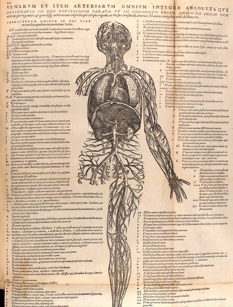
5. De Humanis Corporis Fabrica

Major change in thought and method concerning bookmaking came about as the result of the Italian Renaissance. Italian designers and scholars brought a new set of values to the process of printing. Because the focus of the Italian Renaissance was on the spread of knowledge and a heightened appreciation for scientific fact, the leaders of this movement were less concerned about the detail of ornamentation and illustration, and more concerned in the quality and legibility of universal type treatments. Demand was high for expert calligraphers to instruct the growing literate public how to write properly, and this speedy process of education led to a largely uniform style of writing that covered Europe. 
One example of how bookmaking became a vehicle for the spread of scholarly thought and the development of new social ideas is seen in the printed masterpiece entitled "De Humani Corporis Fabrica." Printed in 1543 by the master printer Johann Oporinus, this 667-page book contained full-detailed descriptions of human anatomy, as presented by Andrea Vesalius, the founder of modern anatomy. Full-page woodcut illustrations were prepared by highly skilled artisans who drew directly from human cadavers to provide scientifically accurate representations. The book was highly applauded for its scientific clarity, wordy text, and precise printing methods that allowed for such advances as page numbers and italics. The immense popularity of this book highlights not only the advancements in modern printing techniques, but also the appetite for the spread of scientific knowledge that characterized the Italian Renaissance.

Thursday, February 24, 2011

Manuscript de Illumination


Here is my illuminated manuscript!
The reason I am drawn to these manuscripts is because of the strong storytelling elements that are found within them. I tried to duplicate this aspect by creating a visual depiction of the confusion that comes with the process of moving away from home. 

Thursday, February 17, 2011

Medieval Devotion and Worship in Art

After learning about the Book of Hours and the medieval practice of creating elaborate books in order to promote reflection and encourage devotion to the common Christian rituals, I became interested in the idea of visual art being used as a form of worship and devotion to a higher power. 


Throughout various cultures and religions, the creation of art has been used in SO many unbelievably different ways to promote devotion to God, both in the artist and in the audience. For example, take stained glass windows. These are beautiful, ornate works of art intended to surround the worshipper and remind him or her of the narratives from Biblical scenes as well as to mimic the beauty and majesty of God. The focus on these works of art is less on the process of creation and more on the process of viewing the work as an outsider, and allowing the work to provoke thought within oneself.


 In a slightly different way, eastern religions tend to focus on the act of creation as a meditative activity that should be used to promote focus on God and truth. Tibetan Buddhist monks perform the art of mandala, during which they create exquisitely detailed drawings with chalk. Upon completion of these drawings, the monks then blow the sand away to symbolize the fleeting nature of life, and to serve as a reminder of the folly of chasing after material pleasures. 


Many artists have found the act of creation to be one of the most rewarding acts of worship. I myself view my sketchbook as my most valuable tool in meditation and prayer. When I flex my creative muscle, I allow God to speak through the gift and the passion he has given me for creation and appreciation of beauty. This is what fascinates me so much about art used in various forms of worship: our feeble human attempts to recreate the handiwork of the divine are what not only bring us to a place of meditation and worship, but also remind us of our place as finite beings in a world so much larger than we are. How's that for a philosophical thought? :) 

Kells


I want to go to Kells. 
After learning about the Book of Kells
and especially after watching The Secret of Kells,
I am pretty much enchanted. 
(Ignore the cliché, if you will). 

I loved this film because it literally brought to life many of the things we had been discussing in class. I felt like the filmmakers did an incredible job of honoring the traditions of Kells. 
Not only did they include Christian religious themes but they also incorporated several pagan themes, which I thought created a really intriguing element. It was lovely.

My favorite part was the illustration. 
The film was obviously paying tribute to the exquisitely beautiful illustrations found in the old insular manuscripts (like the book of Kells). They pulled it off, while updating the style to make it current and approachable. 


Another interesting fact that I discovered while researching this film (because yes, I did find it on Netflix and I did finish it and thoroughly enjoyed every last bit) was the background on the little kitty called Pangur Bán. Pretty interesting name? Yes, actually. Turns out that "Pangur Bán" is the name of an ancient poem written in around the 9th century by an Irish monk. The poem is about a cat, named Pangur Bán, of course, which translates as "white fuller." The anonymous poet uses the descriptions of his cat's daily routine as a metaphor for his own life. Interesting! I love finding little tidbits of information like this. Almost as much as I love little white kitties.

Friday, February 4, 2011

Insular Art...Will the British Isles Ever Get Over It?

The answer is no. I'm fairly certain that England and Scotland and Ireland will NEVER get over the Insular Manuscripts. And they shouldn't. The Insular Manuscripts, or pieces produced in the British Isles during the post-Roman era, are the epitome of British (and Irish and Scottish and Welsh) Art. Some famous examples include the Book of Durrow, The Book of Kells, and the Lindisfarne Gospels (seen below)
I feel like these pieces represent everything that is typical of the art from the British Isles. 
In fact, these pieces have had so much influence that it's hard to find any art or design that truly reflects a British or Irish style without incorporating a lot of elements seen here!
Jameson, a distinctly Irish whiskey company, reflects the style of the Insular manuscripts in its packaging design. Notice the decorative flourishes and regal color scheme.